


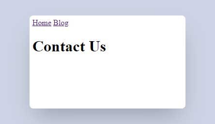
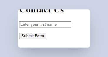
This is our contact-us.html page right now:
HTML Form
In order to add a form to our page, we first need to add the form element. The form element is the container that wraps around all of our form fields.
<form></form>
Although submitting the form is not in the scope of this episode, but I must mention that the form element has two important attributes in order to submit the form data and those are the method and the action attributes.
Inside the <form> tags, I will be adding the form fields that we are discussing below.
Add Text Input to HTML Form
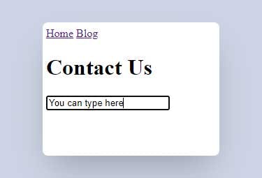
We can add a text field to our form using the input element with its type attribute set to text:
<input type="text">
Save the file and check the result.
We can add a placeholder to the text field using the placeholder attribute.
<input type="text" placeholder="Enter your first name">
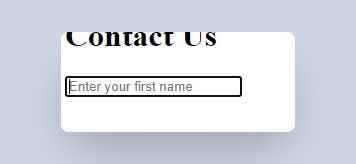
The placeholder will only be visible if there is nothing inside the text field but once you enter something in the text field, the placeholder text will be hidden.
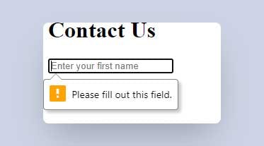
We can also make the input field mandatory by adding the required attribute. So you won't be able to submit the form unless you fill in the field.
<input type="text" placeholder="Enter your first name" required>
The name attribute is also used to reference the form field in JavaScript or when we submit the form data.
<input name="fname" type="text" placeholder="Enter your first name" required>
Add Buttons to HTML Form
There are two elements that can add buttons to our form. We can add a button using the button element or using the <input> tag.
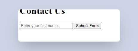
After the text field, insert a <button> tag. The text between the opening and closing <button> tags is the button's text label.
<button>Submit Form</button>
I will also move the button and the text field inside a <div> to separate each of the form fields as a block because they are inline elements.
<form>
  <div>
    <input name="fname" type="text" placeholder="Enter your first name" required>
  </div>
  <br>
  <div>
    <button>Submit Form</button>
  </div>
</form>
The button has an important attribute type which can be set to submit, reset, or button.
The default "type" for a button without the type attribute is submit and that will submit the form.
<button type="submit">Submit Form</button>
If we click on the "Submit Form" button, it will trigger the form to submit the data. Depending on the text field's value, if the text field is empty, we will get an error because the text field has the required attribute, or if we enter something for the text field, we get a page refresh because we don't have an action for our form and that will just refresh the page.
After the "Submit Form" button, insert a new button and set the type attribute to reset.
<button type="reset">Reset Form</button>
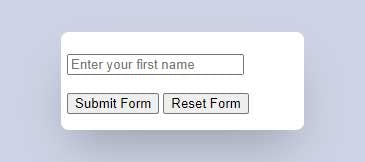
Type something inside the text field and click on the "Reset From" button, it will reset the form fields.
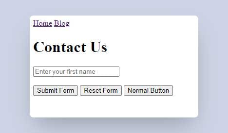
The third value for the type attribute on a button is button which does not have any default behavior and it is mostly used when we want to apply a client-side script to the button.
<button type="button">Normal Button</button>
Here is the code for our form:
<form>
  <div>
    <input name="fname" type="text" placeholder="Enter your first name" required>
  </div>
  <br>
  <div>
    <button type="submit">Submit Form</button>
    <button type="reset">Reset Form</button>
    <button type="button">Normal Button</button>
  </div>
</form>
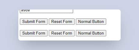
And here is the result:
We can also add the same type of buttons using the <input> tag and by setting its type attribute to submit, reset, or button. The button's text label is set using the value attribute.
<br>
<div>
  <input type="submit" value="Submit Form">
  <input type="reset" value="Reset Form">
  <input type="button" value="Normal Button">
</div>
Save the file and check the result.
Add Label to a Form Field
Let's add a label to our text field. We can use the label element with the <label> tag. Before the text field, add the label element.
<div>
  <label>First Name:</label>
  <input name="fname" type="text" placeholder="Enter your first name" required>
</div>
There are two attributes that we need to set for the label and the text field. First, I will set the id attribute on the text field to name and this will be the unique identifier for the text field. Next, on the label element, I will set the for attribute to name (this targets the id of the field we want to relate to).
<div>
  <label for="fname">First Name:</label>
  <input id="fname" name="fname" type="text" placeholder="Enter your first name" required>
</div>
Save the file and check the result.
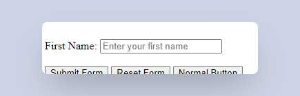
If you click on the label "First Name", the text field will get focused. This functionality is possible because of the for attribute on the label element and the id attribute on the text field element.
Drop-down List
Let's add a drop-down list using the select element. We can add different options to the drop-down list with the option element.
After the text field's section (<div>), enter the following code:
<br>
<div>
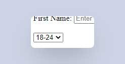
<select>
<option>18-24</option>
<option>25-35</option>
<option>+35</option>
</select>
</div>
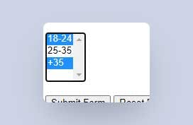
Save the file and check the result.
The value attribute on the option element is what gets submitted as the value of the dropdown list.
<select>
  <option value="18-24">18-24</option>
  <option value="25-35">25-35</option>
  <option value="+35">+35</option>
</select>
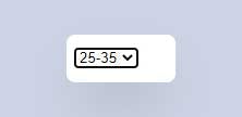
By default, the first value in the list is selected. We can change that by adding the selected attribute to the option that we want to select by default. I will add the selected attribute to the second option.
<option selected value="25-35">25-35</option>
We can also allow the selection of multiple options by adding the multiple attribute to the select element.
<select multiple>
  <option value="18-24">18-24</option>
  <option selected value="25-35">25-35</option>
  <option value="+35">+35</option>
</select>
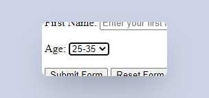
I will remove the multiple attribute from the select element, add a name attribute, and also add a label to it. Here is the final code for the select element:
<br>
<div>
  <label for="age">Age:</label>
  <select id="age" name="age">
    <option value="18-24">18-24</option>
    <option selected value="25-35">25-35</option>
    <option value="+35">+35</option>
  </select>
</div>
Radio Buttons
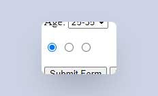
We can add radio buttons using the input element with the type attribute set to radio. After the select element add the following code:
<br>
<div>
  <input type="radio" name="car">

  <input type="radio" name="car">

  <input type="radio" name="car">
</div>
Note that the name attribute for all the options (input elements) needs to be the same (in this case name="car").
I order to submit a value with the radio buttons, we need to set the value attribute for each one of them.
<br>
<div>
  <input type="radio" name="car" value="gmc">

  <input type="radio" name="car" value="toyota">

  <input type="radio" name="car" value="nissan">
</div>
I will also add a label for every radio button so that we know what value each one refers to.
<br>
<div>
  <input type="radio" name="car" value="gmc" id="gmc">
  <label for="gmc">GMC</label>

  <input type="radio" name="car" value="toyota" id="toyota">
  <label for="toyota">Toyota</label>

  <input type="radio" name="car" value="nissan" id="nissan">
  <label for="nissan">Nissan</label>
</div>
By default, non of the radio buttons are checked. We can change that by adding the checked attribute to the option that we want to select by default. I will add the checked attribute to the third option.
<input type="radio" name="car" value="nissan" id="nissan" checked>
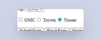
Now that we have the labels for each of the radio buttons, we can click on the label text and that will also select the radio button for us.
Checkbox Input
The checkbox input is the same as the radio buttons but with the type attribute on the input set to checkbox. Add the following code after the radio buttons:
<br>
<div>
  <input type="checkbox">

  <input type="checkbox">

  <input type="checkbox">
</div>
Save the file and check the result.
Similar to the radio button, if we want to submit a value with the checkbox input, each of the inputs need to have a name and a value attribute.
<br>
<div>
  <input type="checkbox" name="language" value="html">

  <input type="checkbox" name="language" value="css">

  <input type="checkbox" name="language" value="php">
</div>
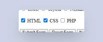
I will also add a label for every checkbox input so that we know what value each one refers to.
<br>
<div>
  <input type="checkbox" name="language" value="html" id="html">
  <label for="html">HTML</label>

  <input type="checkbox" name="language" value="css" id="css">
  <label for="css">CSS</label>

  <input type="checkbox" name="language" value="php" id="php">
  <label for="php">PHP</label>
</div>
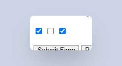
By default, non of the checkboxes are checked. We can change that by adding the checked attribute to the checkbox that we want to select by default. I will add the checked attribute to the first and second checkboxes.
<input type="checkbox" name="language" value="html" id="html" checked>

<input type="checkbox" name="language" value="css" id="css" checked>
Save the file and check the result.
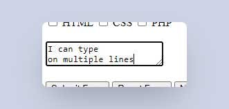
Textarea Input
Textarea element allows us to input multi-line text. We can insert it using the <textarea> tag. After the checkbox inputs, insert the following code:
<br>
<div>
  <textarea></textarea>
</div>
Save the file and check the result.
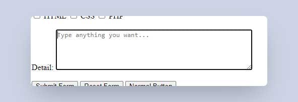
We can set the rows (number of rows) and the cols (number of columns) attributes for the textarea to change its width and height. I will also set the placeholder attribute for the textarea.
And last thing, add a label for the textarea so that it matches the rest of the form fields.
<br>
<div>
  <label for="detail">Detail:</label>
  <textarea id="detail" cols="50" rows="5" placeholder="Type anything you want..."></textarea>
</div>
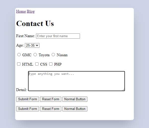
And here is the final look of the contact-us.html page:
We covered the most common used form fields but there are a lot of other form fields and you will be using them depending on your needs.